Every second of the day, PowerPoint is used in approximately 350 presentations around the world. To put that into perspective, there are more PowerPoint presentations born every second than babies.
If you’re planning to use PowerPoint (along with 30,240,000 other people every day), it’ll be important that your slides can stand out and be memorable.
Brian Washburn from Train Like a Champion and I are here to help! In this second edition of our Trick Out My PowerPoint series (did you catch the original post?), we’ve taken a look at an actual slide from a conference Brian recently attended and put our own spin on the design of the slide.

While the presentation itself featured good, relevant information, here’s a sample of how Brian and I would have “tricked out” this slide deck for maximum impact on the audience:
Trick-out Artist #1: Brian Washburn
Brian says:
All the information is there on this slide, and I would have broken up the bullet points into four separate slides (when you list all your bullet points on one screen, your audience will be too busy reading the text on your slide to pay attention to what you have to say… the brain can’t do both things at once!).
To me, the word “goal” lends itself very easily to a sports metaphor. One way to trick out this slide deck, at least this particular section revolving around goals, would be to turn the slide into a stadium scoreboard, complete with jumbo tron screen for the image.

The word “goal” also reminds me of the old “fundraising thermometer” whereby reaching one goal is a small victory along the way, but the ultimate destination is to reach every single goal.

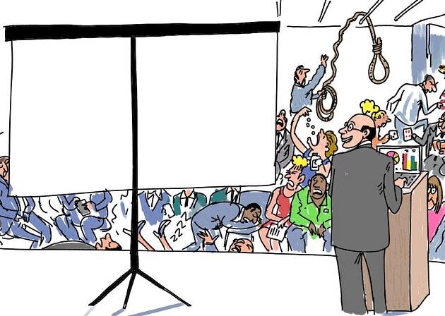
Finally, there are times when someone at a higher pay grade than I insists that a slide template must be used. There are so many reasons I don’t like slide templates, but the biggest one is because the slide template eats up valuable slide real estate. Nonetheless, if a slide template is required, it doesn’t prevent the visual imagery of your PowerPoint slides from being powerful. I might put together a series of slides that looks like this…

Followed by a series of slides with text that is not blurry:

During the delivery, I’d make the point that without all four of these goals being achieved, millions of people would remain corneal blind and those blurry slides represent all they would be able to see.
Trick-out Artist #2: Michelle Baker
Michelle says:
Well, I took the challenge in another direction. Ordinarily, my gut reaction would have been to take the same approach as Brian suggested, to divide the content among multiple slides. But as I looked at the slide, I couldn’t help but wonder if I could actually communicate the point of the slide on one individual slide, without looking cluttered or forced?
As a reminder, here is the original slide:
I transformed this slide three ways – here is what I came up with:
Option 1: Simple and Straightforward
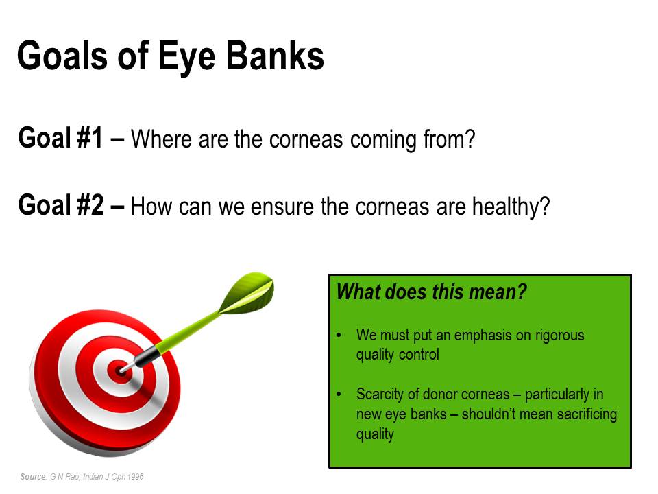
On this slide, I specifically called out the two goals of eye banks, using a simple “bullseye” graphic for participants to identify these goals with the importance of achieving the goal. Using a callout box in a contrasting color, I added the additional talking points. The box and color breaks up the text, and allows the participant to focus on “zones” in the slide, rather than looking at many text rows. You could also utilize PowerPoint’s animation/transition features to have the text box float in after discussing the two goals, to make the slide appear even cleaner.
Option 2: Let SmartArt Do the Work
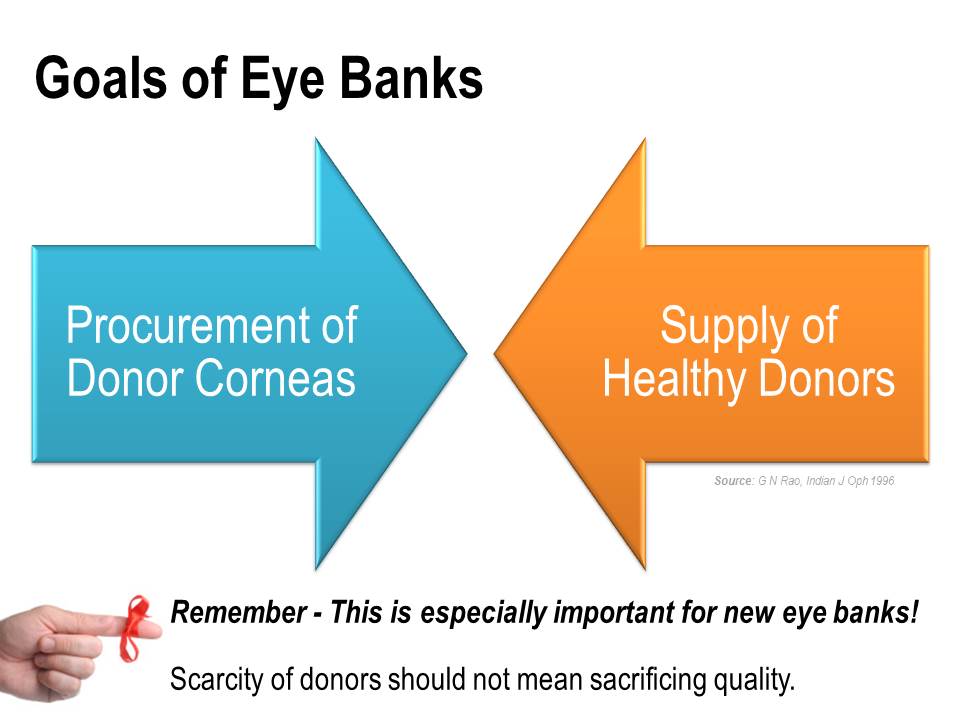
When used properly, SmartArt can be a very effective way to visually convey information on a slide without using too much text. It’s a wonderful, easy-to-use feature for non-graphic designers (like myself!) to add to their PowerPoint design arsenal. For this slide, I used two converging arrows. This particular graphic clearly shows the relationship between the two goals of eye banks, and why they are so important to work in conjunction with one another. The ribbon-tied finger graphic at the bottom adds a bit of personality to the reminder of why this is important, particularly for new eye banks.
Option 3: A strong graphic can make all the difference

Leaning on the participants’ perceived passion around healthy eyes, I used a strong graphic of a stunning blue eye as the focal point of this slide. By adjusting the image size, the eye appears to fade directly into the blank, white canvas of the slide, which provides an ideal space to add my text – simply stated and clean. Again, using basic animation/transition functionality, I would add the “What does this mean?” subtext after discussing the two primary goals.
On all three slides, I made sure to call out the source information, but notice that I used a muted gray color for the font in a smaller size – it is visible, but does not compete with the primary message the slide coveys.
Another point of consistency is the use of animation/transition functionality – subtle is key; avoid crazy twirls, spins and checkerboard effects! A simple float or fade will suffice, and use the same effect, speed and direction throughout your entire slide deck for a polished, professional look.
So, there you have it. Between Brian and Michelle’s unique approaches, you see 6 very different, tricked-out approaches for the same PowerPoint slide. Maybe give one of these styles a try the next time you’re faced with refreshing a text-laden slide?
What say you?
How would you trick out this slide? What is your preferred approach? Share your creative ideas in the comments below!
Need some help Tricking Out Your PowerPoint?
Let Brian and Michelle give it a shot! Send us a slide, and we might just feature it in an upcoming blog post on Train Like a Champion and Phase(Two)Learning!
Stay tuned for a big phase(two)learning announcement coming soon!
Don’t miss it – subscribe to receive email updates from phase(two)learning…you’ll be glad you did!